STEPS Skincare
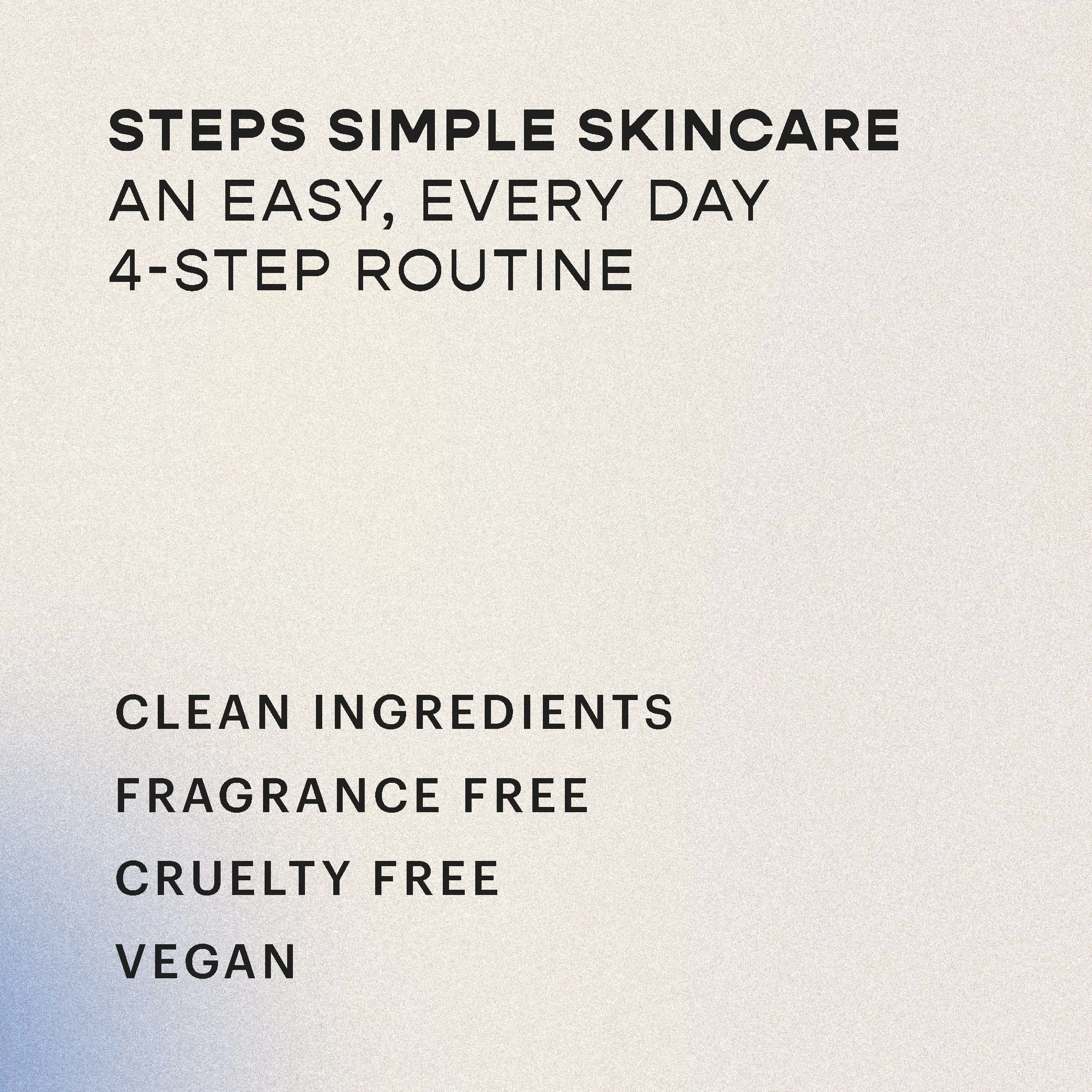
STEPS Skincare was driven by a simple question: why does skincare have to feel so overwhelming? In a market crowded with products, steps, and promises, the brand takes the opposite approach. Making skincare simple, approachable, and easy to understand. Its thoughtfully designed products and routines help people feel confident in their daily skincare, without the clutter or confusion.
Overview
Art Direction
Brand Identity Design
Print & Digital Collateral Design
Brand Tone & Voice Collaboration
Roles
Adobe CC
Figma
Wordpress
Canva
Kive
Programs
Industry
Cosmetic
The Challenge
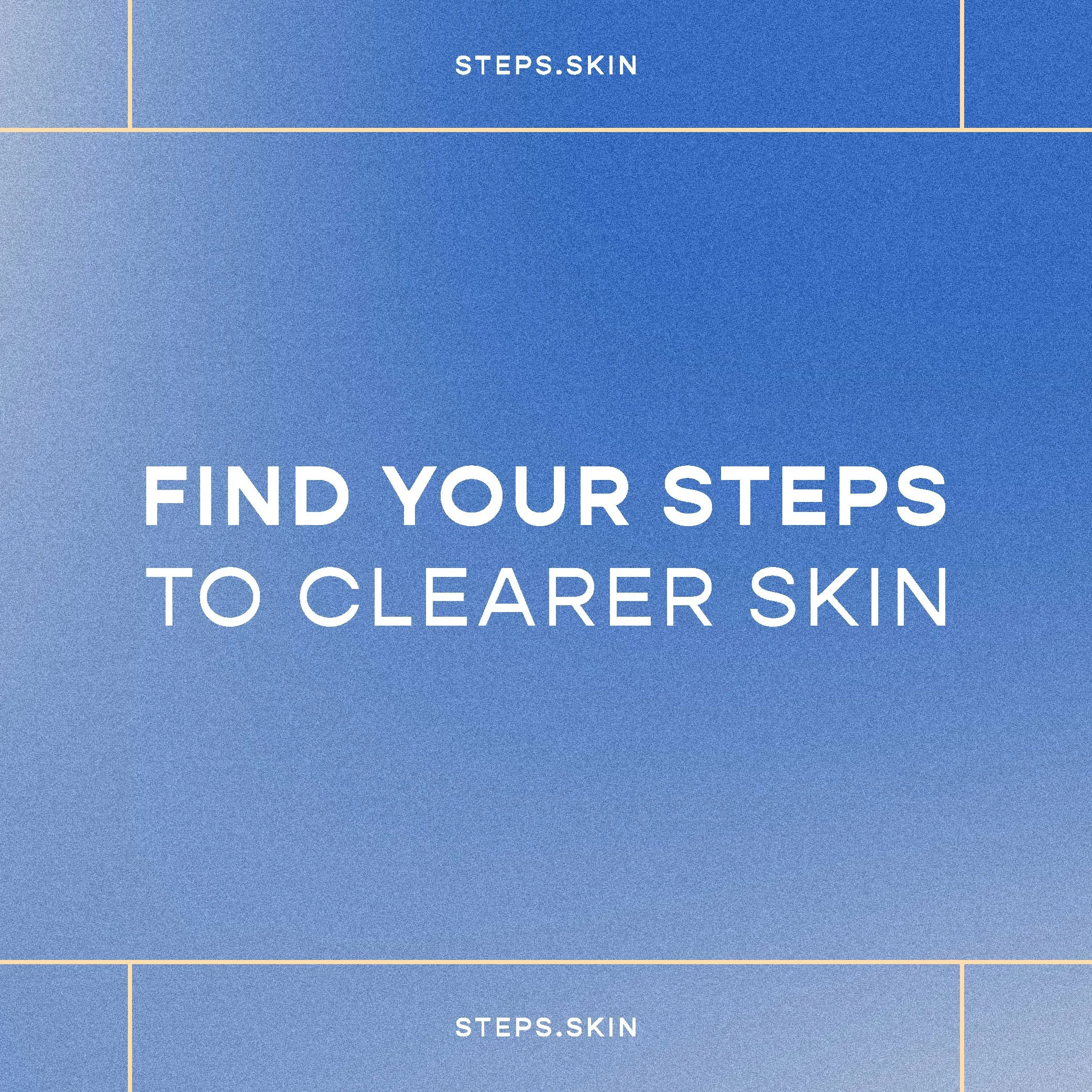
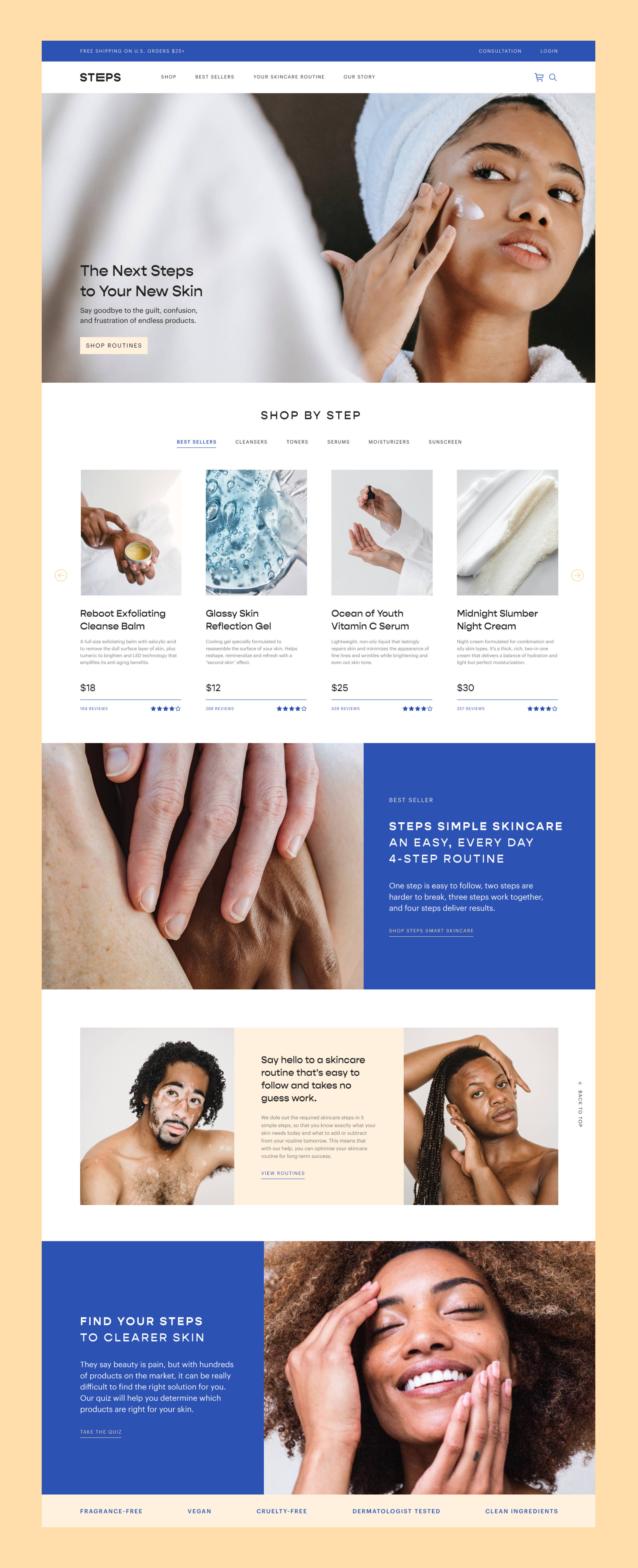
The challenge for STEPS Skincare was translating their brand personality into a visual identity that felt simple, approachable, and fun—without overwhelming the audience. In a crowded, attention-driven industry, the brand needed to stand out while still feeling professional and trustworthy. Our goal was to create a design system that communicates clearly at every touchpoint, balancing playful energy with clean, thoughtful structure.
The Result
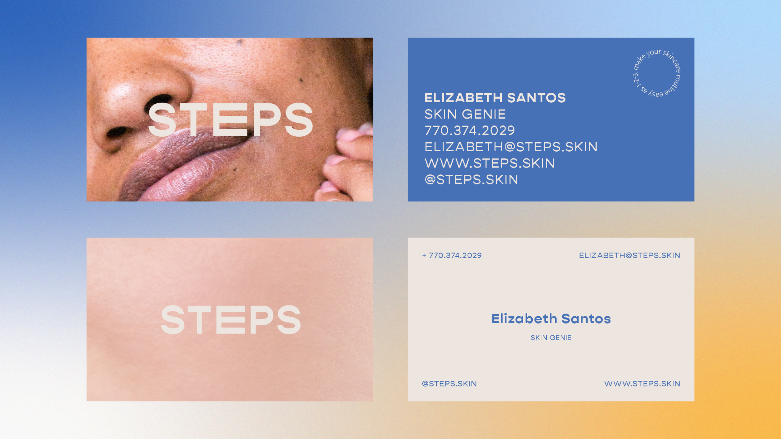
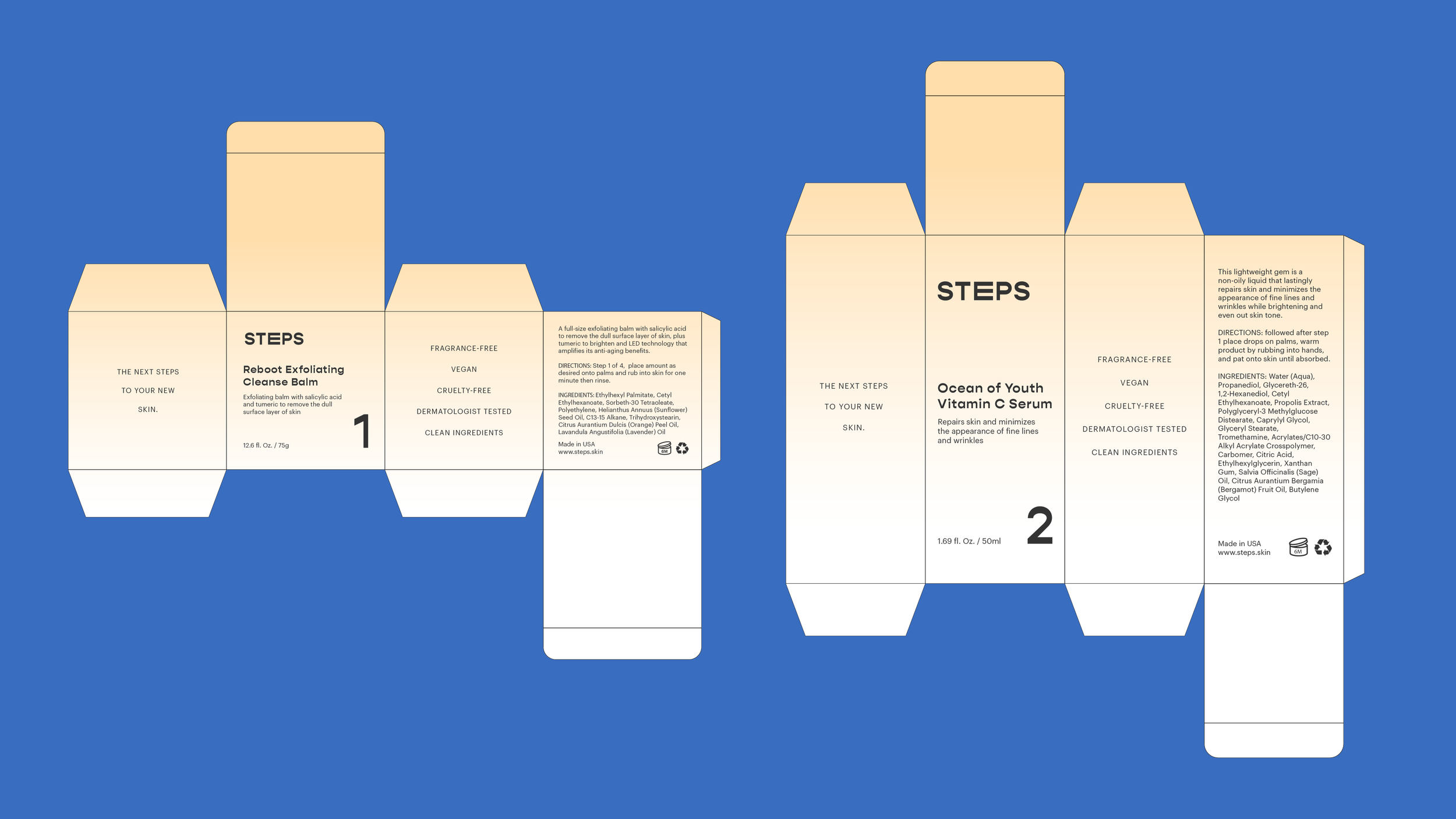
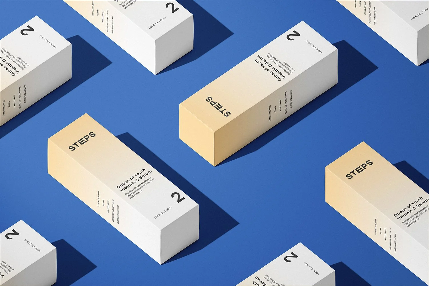
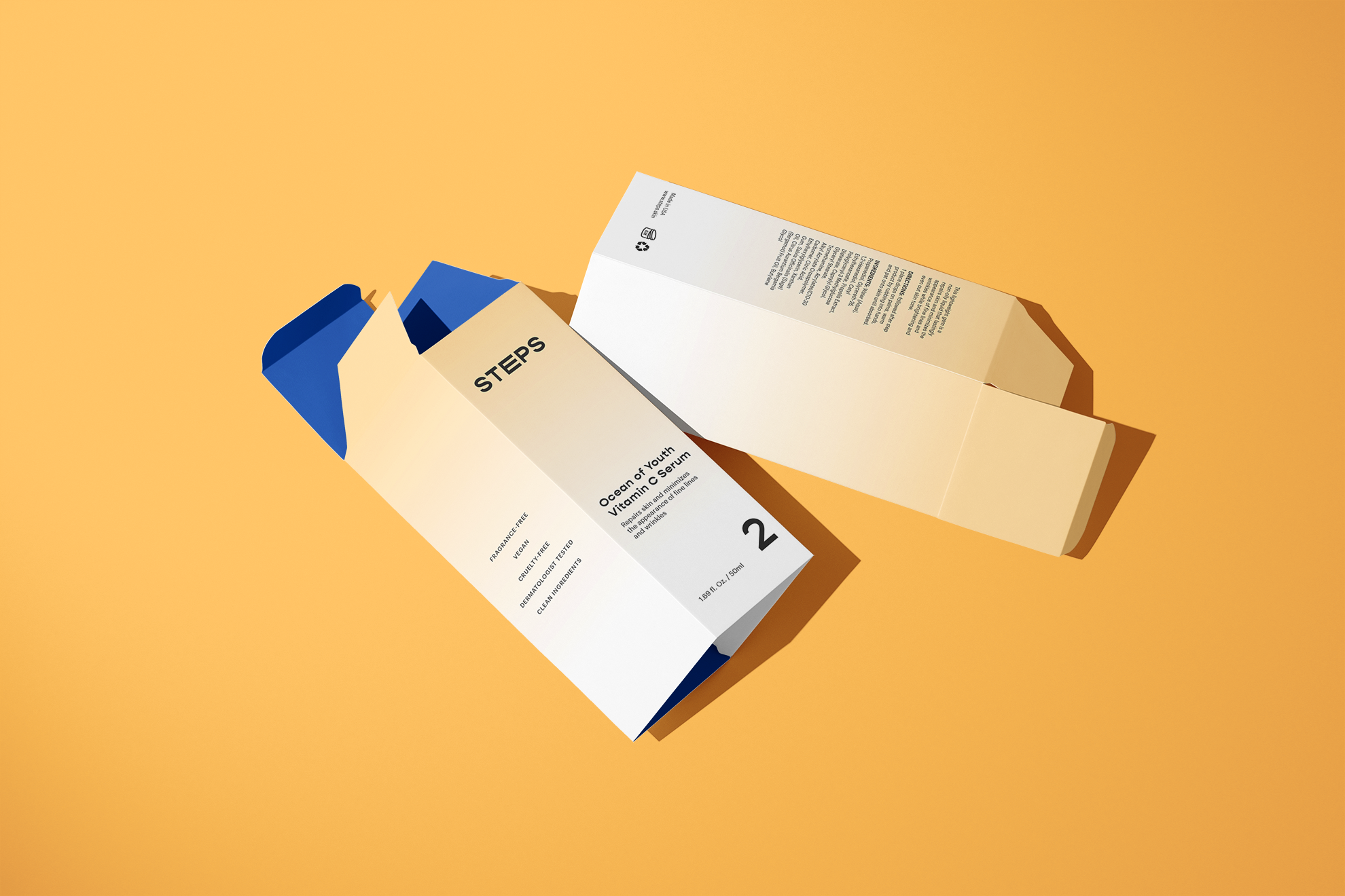
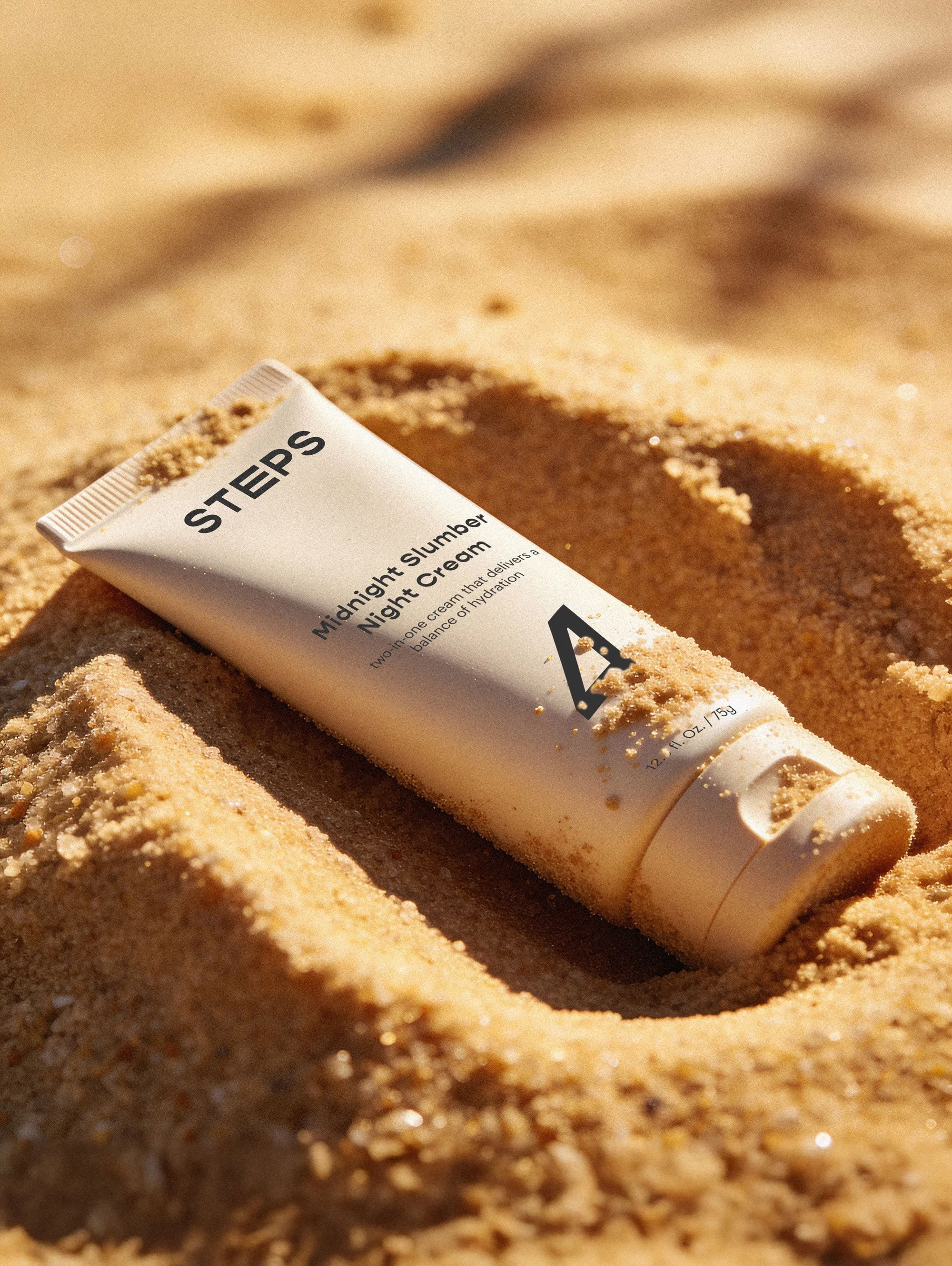
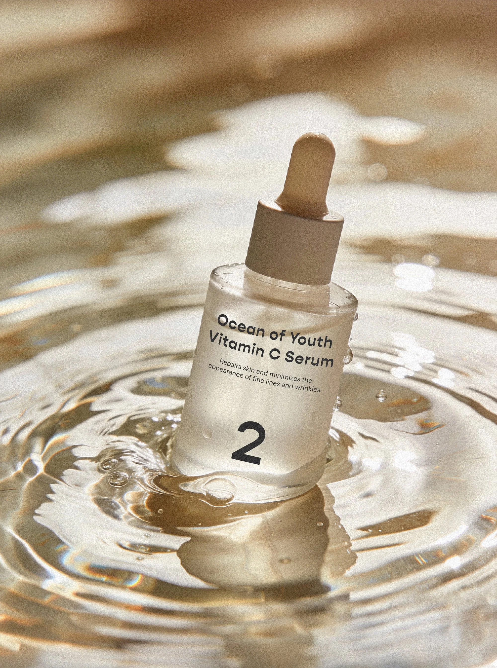
The result is a clean, approachable identity that mirrors the product philosophy itself: effective skincare, simplified. No excess, no confusion, just thoughtful design supporting a calm, intentional experience.
Every element, from typography and color to iconography and layout, was thoughtfully crafted to help the brand engage customers with confidence while keeping the experience intuitive and enjoyable. The identity extends across logo design, packaging, social assets, business cards, and a website prototype, each guided by a step-based structure, clear labeling, and plain-spoken language. Every decision removes friction, creating a brand that’s easy to understand, easy to use, and easy to trust.